Link in Bio Landing Page: How to Create One (2026)
Your link in bio can be a real landing page — one goal, one CTA, proof that converts. How to create one behind your bio link, no website or code needed.
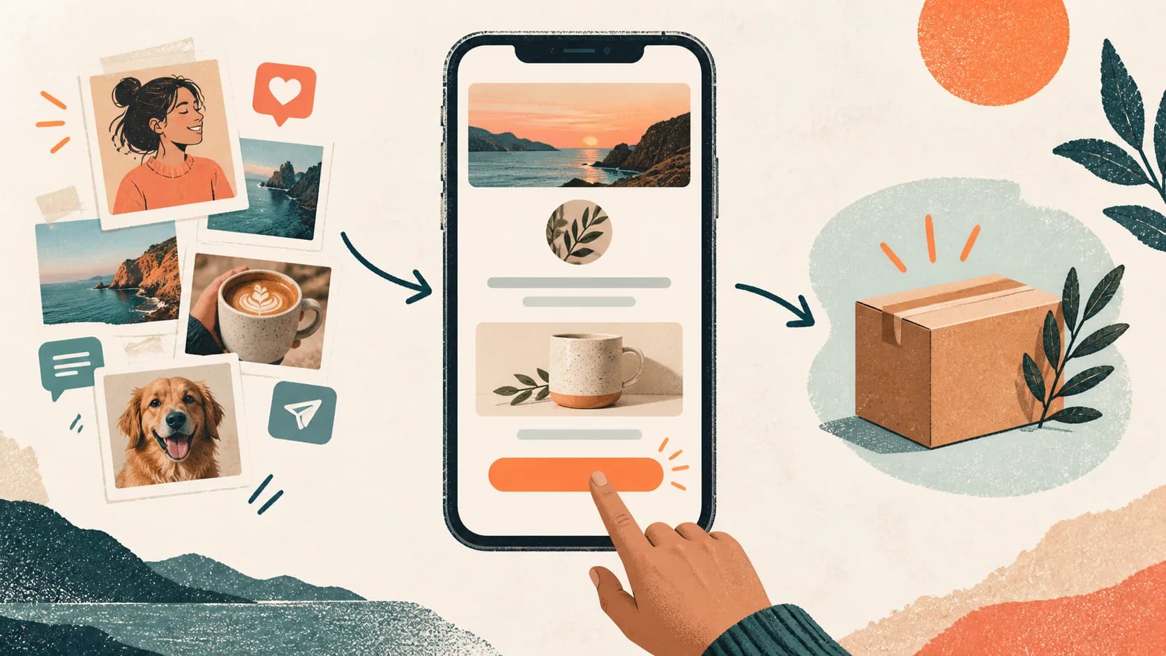
"Landing page" usually means something you build with a website builder for a campaign, and "link in bio" means a list of buttons. The visitor tapping your profile link doesn't know about either category — they just land on a page and decide, in a few seconds, whether to act or leave. Creating a landing page in your bio means making that page work the way conversion pages work: one goal, one action, and every element on the page earning its place toward it.
Short answer
A link in bio landing page is a single mobile page with one conversion goal — book a call, buy a product, join a list — instead of a menu of destinations. You don't need a website, a domain or code to create one: a bio link tool gives you the page and the URL, and this guide gives you the structure.

Link list or landing page: which one is behind your bio?
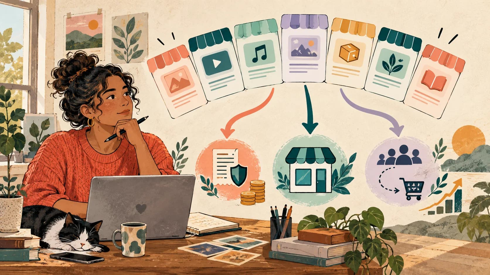
The difference isn't the tool, it's the job. A link list distributes attention: here's my shop, my podcast, my socials, pick one. A landing page directs it: here's the one thing I'm offering, here's why it's worth it, here's the button.
A quick diagnostic for the page you have now: if you deleted every link except one, would the page still make sense? If it collapses, you have a list — its whole identity is offering options. If it holds up, you already have a landing page and the rest of this guide will sharpen it.
Neither is wrong in the abstract. A list is fine when your bio's only job is navigation — "where else do I exist on the internet." The moment your bio has a commercial job — selling a service, filling a calendar, growing a list — the landing page framing wins, because a visitor facing one clear path converts more often than a visitor facing six equal buttons. That difference in framing is also the real dividing line between tools, more than any feature checklist: the SellBio vs Linktree comparison is essentially a list tool and a landing page tool side by side.
What a landing page needs that a link list doesn't
Strip any high-converting landing page — a SaaS signup page, a course sales page — down to its skeleton and you find the same four elements. All four fit on a bio-sized page.
1. One goal. Decided before you touch the editor. Not "get clicks" — one specific conversion: booked call, sold ebook, email captured. Every other decision on the page follows from this one.
2. An offer stated in one line. What you do, for whom, with what outcome. "I help first-time founders get their pricing right" is an offer. "Welcome to my official page" is a greeting, and greetings don't convert.
3. Proof. One testimonial, one number, one recognizable result — anything that makes the offer believable. This is the element bio pages skip most, and it's rarely a space problem: a single line of proof under the offer costs almost nothing and answers the visitor's only real question, does this actually work?
4. One primary call to action. A button that names the action and stands out from everything else on the page. Secondary links can exist — smaller, lower, visually quiet — but exactly one button gets the accent color and the first screen.
That's the whole skeleton. Notice what's not on the list: your five social profiles, your three latest posts, the podcast player. Those belong on a link list, and on a landing page they're the noise the conversion gets lost in.
How to create your link in bio landing page, step by step
Step 1 — Pick the one conversion. If you sell several things, pick the one that matters this month; the others move down the page or off it. A landing page per season beats a permanent page that tries to sell everything at once.
Step 2 — Write the headline as the offer, not a welcome. The first line of text under your photo is the most-read sentence on the page. Spend it on the offer: what + for whom + outcome. If you can add specificity — a number, a timeframe, a niche — it gets stronger.
Step 3 — Put the CTA on the first screen. One button, verb first, naming what happens on the other side: "Book a 15-min intro call," "Get the template pack." The visitor shouldn't have to scroll to find the action. If you want the full method for writing labels and building visual hierarchy, the customization guide covers both in depth — this page only needs the conclusion: one primary button, named after its destination.
Step 4 — Add the shortest proof you have. One client quote with a name beats three anonymous paragraphs. "127 coaches used this template" beats "many happy customers." Put it directly under the offer or the CTA, where the hesitation happens.
Step 5 — Cut what doesn't push toward the goal. The row of social icons at the top is the classic: you just earned a visitor from Instagram, and the first thing a link list offers them is a way back to Instagram. On a landing page it goes — along with expired promos, the "coming soon" button, and anything else that competes with the conversion.
Step 6 — Publish behind a URL that looks like you, then test on your phone. sellb.io/yourname reads as yours in a way a random subdomain never will. Open the published page from your actual bio, on your actual phone: five seconds should be enough to know what's offered and where to tap.
The message-match rule
Ad agencies live by one rule for landing pages: the page must continue the message that produced the click. Your bio version — the reel that made someone tap should be answered by the first screen of the page. If the reel promised "my 3-step pricing method" and the page opens with a generic menu, the thread breaks and the visitor leaves. When you promote something in content, put it at the top of the page the same day.
The mobile reality: your landing page lives inside another app
A classic landing page gets visitors from ads and email, on every screen size. Your bio landing page gets nearly all its traffic from a phone, inside Instagram's or TikTok's in-app browser — a narrow column with the app's chrome eating the top of the screen.
Two practical consequences. First, the first screen is smaller than any editor preview suggests, so the offer and CTA have to survive above a very low fold — which is exactly why steps 2 and 3 above insist on it. Second, in-app browsers punish heavy pages: every second of load costs visitors who tapped on impulse and won't wait. Keep images light, keep embeds few.
Design details beyond that — contrast, readable type, dark mode behavior — are the same ones covered in the customization guide, and they matter here for the same reason: a landing page that can't be read in sunlight converts like it isn't there.
Do you still need a website?
For the conversion itself: no. A bio landing page can hold the offer, the proof, the CTA — and with a checkout on the page, the payment too, which is the setup covered in selling directly from your bio link. For plenty of coaches, consultants and creators, the page behind their bio outperforms their actual website for a simple reason: it's the page their audience actually visits. All the traffic your content produces lands there first.
A website still earns its keep for other jobs — long-form content, SEO, a home for everything that isn't this month's offer. The honest way to see it: the website is your archive, the bio landing page is your storefront. If you're a consultant whose entire pipeline starts on LinkedIn and Instagram, the storefront is the one doing the selling — and it deserves the same intention a paid-traffic landing page gets.
From landing page to funnel: capture and branching
A landing page has one goal, and that's its power — but audiences are mixed. The person ready to book and the person who found you yesterday are standing on the same page, and one offer can't fit both.
The upgrade isn't adding more buttons back (that's the list again). It's making the page ask before it shows: one question — "what brings you here?" — and the page branches. The ready visitor goes straight to the calendar; the new one gets the free guide and a place to leave their email. Each sees a shorter page than the one you'd design for both, which is conditional logic doing what a static page can't.
Capturing the not-ready-yet visitor is its own discipline — what to offer in exchange for the email, where the form goes, what happens after — and the lead capture guide walks through it. The short version: a landing page that converts 3% of visitors into buyers and lets the other 97% vanish is leaving most of its value on the table.

The mistakes that keep a bio landing page from converting
A headline about you instead of the offer. "Founder · Speaker · Dreamer" tells nobody what's on offer. The bio line above the link already introduces you; the page's first line should sell.
Two primary CTAs. The moment two buttons compete for the same attention, you're back to running a list. One accent color, one first-screen button — everything else steps back.
No proof anywhere on the page. The most common gap and the cheapest to fix. One named testimonial, today.
A permanent page in a seasonal business. The launch ended three weeks ago and the page still leads with it. A landing page is a living asset: what you promote in content and what the page leads with should match, always.
Never measuring. Without per-link clicks you can't tell which changes helped. Any serious tool reports this on the free plan; the analytics guide covers which numbers matter and what to do about them.
Creating a landing page in your bio is mostly an act of subtraction: one goal instead of six, one button instead of a menu, one line of proof instead of a wall of links. The structure fits any tool that gives you a page — though tools built as lists will fight you on hierarchy, and tools built as flows will hand it to you. For where the page fits in the bigger picture of running your bio, the complete link in bio guide covers the full path.
Explore SellBio plans, choose the page structure that fits your goal, and test the complete journey on mobile before publishing.
Related reads
- How to Customize Your Link in Bio Page — Labels, hierarchy and design decisions in depth
- Complete Guide to Link in Bio 2026 — Setup and strategy around the page
- Capturing Leads From Your Bio Link — What to do with visitors who aren't ready to buy
Ready to turn followers into customers?
Sell products, capture leads, take bookings, and guide every visitor from one link.